Table of Contents
ToggleA flooring showroom isn’t just retail space, it’s a selling tool. The way samples are displayed, how customers move through the space, and even the overhead lighting can make or break a sale. Homeowners shopping for hardwood, LVP, or tile need to visualize materials in context, compare finishes side-by-side, and feel confident in their choice before they walk out. This guide breaks down practical design strategies for flooring retailers looking to maximize conversions, reduce decision fatigue, and create an environment where products sell themselves.
Key Takeaways
- Flooring showroom design directly impacts sales by using strategic layout, proper lighting, and material grouping to guide customers naturally and minimize decision fatigue.
- Mount samples at eye level (48–60 inches high) with clear labeling and adequate size to showcase texture and grain; platform vignettes with actual installations let customers visualize flooring in real-world contexts.
- Optimize lighting with neutral LED fixtures (3500K–4000K color temperature) and adjustable spotlights to enhance texture and color accuracy, while avoiding warm fluorescent or colored bulbs that distort flooring appearance.
- Keep showroom walls and fixtures in neutral tones (soft grays, whites, taupes) so the flooring samples remain the visual hero without competing backgrounds.
- Integrate interactive technology like AR apps, QR codes, touchscreen kiosks, and digital sample checkout systems to accelerate customer decision-making and reduce reliance on staff assistance.
- Organize flooring by material type (hardwood, LVP, tile) within each zone, rotate seasonal inventory into prime display areas, and maintain main aisles at 4+ feet wide to accommodate comfortable customer movement.
Layout and Flow: Designing for Customer Movement
A showroom layout should guide customers naturally from entry to consultation without bottlenecks or dead ends. The goal is to expose shoppers to a range of products while avoiding overwhelm.
Main traffic aisles should be at least 4 feet wide to accommodate couples, strollers, or wheelchairs. Side aisles displaying samples can taper to 3 feet. Avoid tight corners where large flooring boxes or display boards create obstacles.
Entry placement sets the tone. Position high-impact displays, like a dramatic wide-plank hardwood or a chevron pattern installation, within the first 10 feet of the entrance. This draws customers in and signals quality immediately.
Zoning by material type works better than mixing everything. Group luxury vinyl planks in one area, hardwood in another, tile separately. Within each zone, organize by color family or style (rustic, contemporary, industrial). This lets customers drill down without backtracking.
Consultation stations should sit toward the rear or side of the showroom, not blocking the main path. Include a table for spreading samples, lighting controls to simulate different conditions, and access to a computer for pricing and inventory checks.
Avoid the temptation to cram every SKU into view. Rotate seasonal or trending products into prime real estate, and keep overflow samples in pull-out drawers or binders for customers who want to dig deeper.
Display Strategies That Showcase Flooring at Its Best
Flooring is tactile and visual. Shoppers need to see it underfoot, feel the texture, and imagine it in their own space. Display methods should accommodate all three.
Vertical Displays and Wall-Mounted Samples
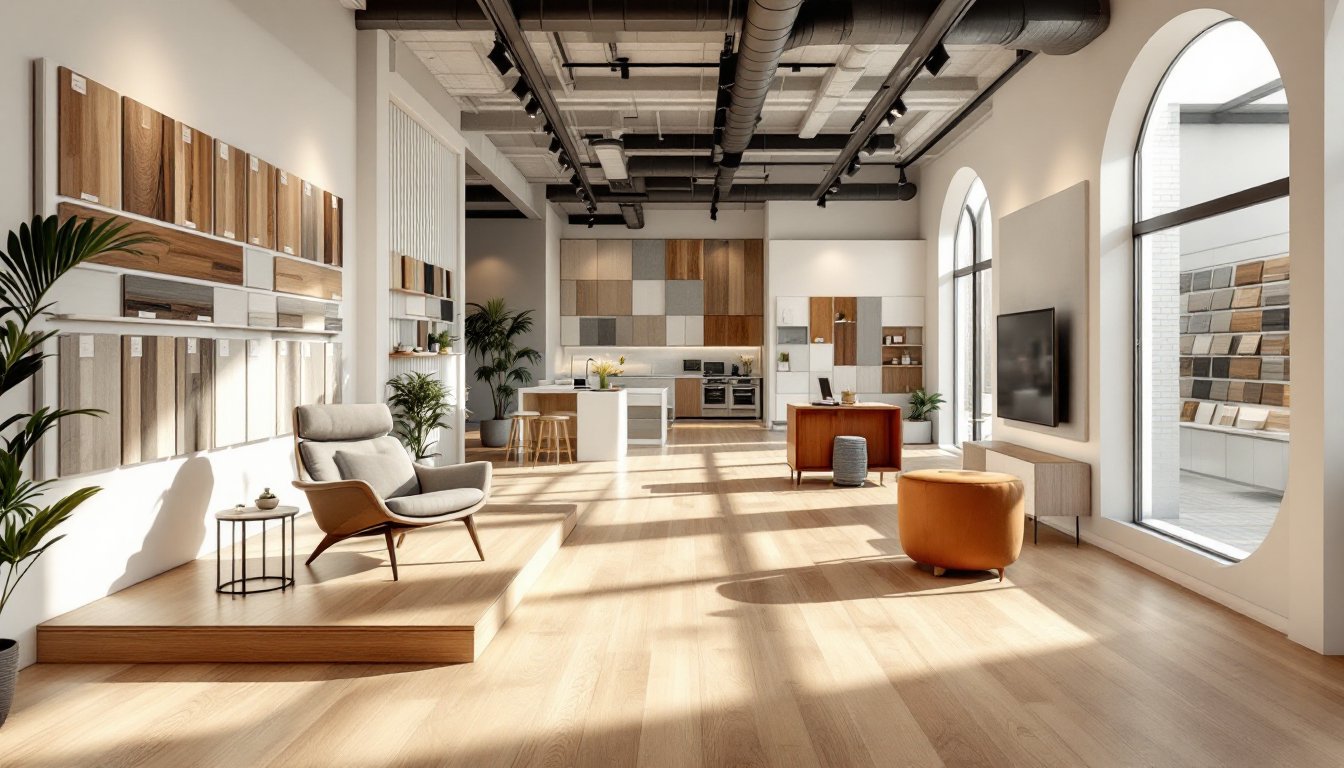
Wall-mounted boards are space-efficient and allow customers to compare dozens of samples at eye level. Use slatwall panels or hinged display racks that flip open to reveal multiple planks or tiles per board.
Sample size matters. For LVP and hardwood, mount planks that are at least 12 to 18 inches long, big enough to show grain variation and plank width. For tile, display full 12×12-inch or 12×24-inch pieces, not tiny chips that don’t convey scale.
Label each sample clearly with product name, species (for wood), wear layer thickness (for LVP), and price per square foot. Skip vague descriptors like “premium” or “deluxe”, customers want specifics.
Keep high-traffic samples within 48 to 60 inches from the floor, roughly eye level for most adults. Place budget or specialty items higher or lower, but make sure they’re still accessible.
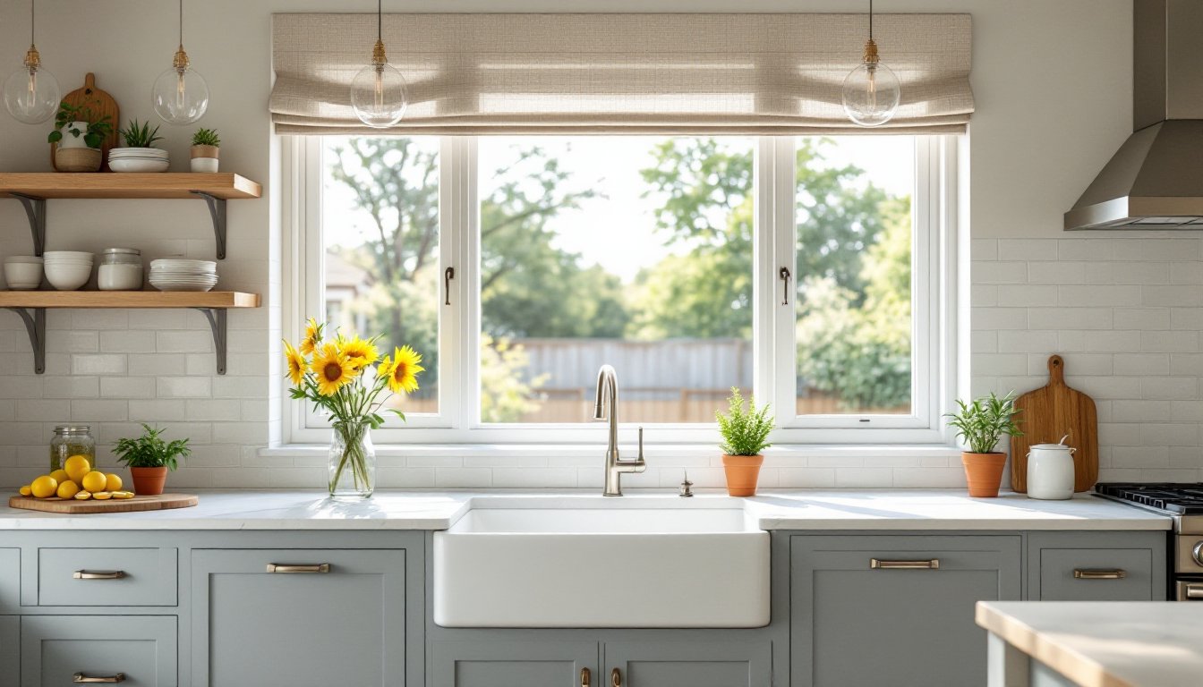
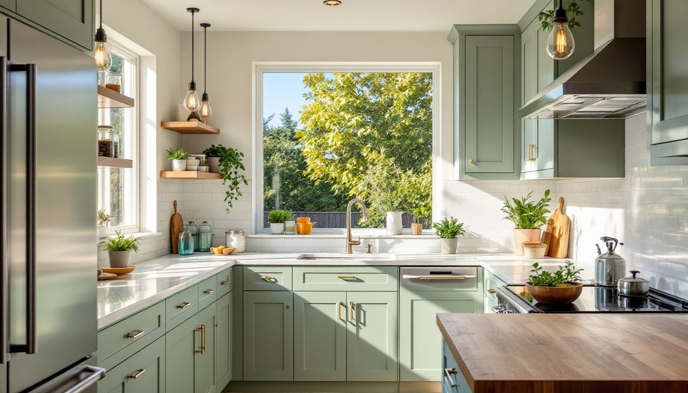
Room Vignettes and Lifestyle Settings
Nothing sells flooring like seeing it installed. Build at least two to three room vignettes, mock living rooms, kitchens, or bathrooms with actual flooring installed underfoot, not just propped against a wall.
Platform installations work well. Frame out a low platform (4 to 6 inches high) with 2×6 or 2×8 lumber, install 3/4-inch plywood subfloor, and lay the flooring exactly as it would go in a home. This lets customers walk on it, hear the sound, and assess comfort.
Furnish vignettes minimally, a sofa, a rug, a side table. The flooring should be the hero, not the decor. But context matters: pairing a wide-plank white oak with mid-century furniture reinforces its versatility.
Rotate vignette flooring every 6 to 12 months to showcase new inventory or seasonal trends. Platforms are modular enough to swap out without demolition. Professionals working on interior design trends often recommend showing materials in layered settings rather than isolation.
Lighting Techniques to Enhance Flooring Appearance
Lighting is the most underestimated factor in a showroom. Poor lighting flattens texture, distorts color, and kills sales.
Natural light is ideal but inconsistent. If the showroom has windows, position vignettes near them so customers can see flooring in daylight. But don’t rely on it exclusively, cloud cover and evening hours require backup.
Overhead lighting should be bright but neutral. Use LED high-bay fixtures or linear track lighting with a color temperature of 3500K to 4000K, warm enough to feel inviting, cool enough to render colors accurately. Avoid sodium or old fluorescent bulbs, which skew yellow and make wood tones look muddy.
Adjustable spotlights help. Mount track heads on swivels so staff can angle light across flooring samples to highlight texture, grain, or embossing. Graze light at a low angle to emphasize wood grain or tile relief: direct it straight down for a flatter, more uniform look.
Dimmer switches let customers see how flooring appears under different conditions, bright kitchen lighting versus a moody living room. Install dimmers on at least one zone in each material section.
Avoid colored accent lighting or RGB LEDs in display areas. They distort color perception and create unrealistic expectations. Save creative lighting for entryways or branding zones, not product displays.
Color Schemes and Interior Finishes for Your Showroom
The showroom’s own finishes should recede, not compete. Walls, ceilings, and fixtures exist to frame the flooring, not steal attention.
Wall color: Stick to neutral grays, whites, or soft taupes. A clean Sherwin-Williams Repose Gray (SW 7015) or Benjamin Moore White Dove (OC-17) works well. These provide a blank canvas that doesn’t cast color onto wood or tile samples.
Avoid bold accent walls unless they’re in a non-display area like a restroom or office. A navy or forest green wall might look striking, but it’ll make gray LVP look greenish and throw off color decisions.
Ceiling treatment: White or light gray is standard. If the space has exposed ductwork or bar joists, paint them matte black or dark gray to push them visually into the background. Drop ceilings with 2×2-foot or 2×4-foot acoustic tiles work fine and hide wiring, but they can feel dated, consider exposed ceilings with spray-applied acoustic treatment if budget allows.
Flooring underfoot in non-display areas: Use polished concrete, commercial-grade LVP, or sealed hardwood. Whatever you choose, it should be durable and easy to maintain. Avoid plush carpet, it’s a dust trap and makes rolling sample carts difficult.
Fixtures and millwork: Keep display cabinetry, trim, and furniture in natural wood tones or painted white. Chrome, matte black, or brushed nickel hardware reads as professional without clashing. Design strategies found in modern interior trends emphasize minimalism that allows materials to stand out.
Interactive Elements and Technology Integration
Customers expect more than static samples. Interactive tools reduce hesitation and speed decision-making.
Touchscreen kiosks or tablets let shoppers browse the full catalog, filter by price or style, and visualize flooring in sample rooms. Platforms like those featured on Houzz offer visualization tools that showrooms can license or integrate via API.
Augmented reality (AR) apps are becoming table stakes. Load them onto iPads mounted in consultation areas or encourage customers to download them on their phones. Apps that overlay flooring onto a live camera feed of the customer’s actual room eliminate guesswork. Mention this capability upfront, it’s a differentiator.
QR codes on sample boards link to installation videos, product specs, or reviews. Print them on small labels next to each SKU. This reduces staff load and lets introverted shoppers research independently.
Sample checkout systems speed the process. Let customers scan a QR code or fill out a digital form to request take-home samples, then grab pre-pulled kits from a designated shelf. Skip the clipboard and paper form.
Large-format monitors can loop installation time-lapses, before-and-after projects, or manufacturer videos. Mount them high on walls in waiting areas or above consultation desks. Keep videos silent or captioned, showrooms are often noisy.
For inspiration on integrating modern design tools, resources like Dwell showcase how technology enhances spatial planning and material selection.
Wi-Fi access should be free and password-free. Customers researching on their phones or comparing prices online will appreciate it, and it keeps them in the showroom longer.
Don’t over-tech. A tablet with a broken screen or a kiosk running outdated software looks worse than no technology at all. If you add it, maintain it.