Table of Contents
ToggleDoors and trim occupy more visual real estate than most homeowners realize. Walk through any room and you’re registering baseboards, casings, and door frames, even if you’re not consciously aware of it. Get the color wrong and the whole space feels off. Nail it, and suddenly your builder-grade ranch looks intentional.
In 2026, homeowners are moving beyond the default bright white trim that dominated for decades. Dark moody hues, warm earthy neutrals, and strategic contrast are reshaping interiors. Whether you’re refreshing existing trim or painting new millwork, understanding how door and trim colors interact with wall paint, flooring, and natural light will save you from costly repaints.
Key Takeaways
- Interior door and trim colors are critical design elements that influence perceived space size, lighting behavior, and overall home aesthetics—moving beyond traditional bright white toward bold darks and warm neutrals in 2026.
- Choose between matching doors and trim for a cohesive, streamlined look, or use contrast (dark doors with white trim, or doors one shade darker than trim) to add depth and visual interest in larger, well-lit rooms.
- Warm neutral trim colors like greige and taupe create cozy, layered spaces that work with both cool and warm wall colors while hiding dirt and scuffs better than pure white—ideal for high-traffic areas.
- Always test interior door and trim color samples in your actual space under different lighting conditions (morning, afternoon, and evening) before committing, as store lighting can misrepresent how whites and other hues will appear.
- Semi-gloss finish is the industry standard for doors and trim due to superior durability and moisture resistance; proper surface prep with 150-grit sanding, priming (especially for dark colors), and two thin coats ensures a professional-looking result.
Why Door and Trim Colors Matter More Than You Think
Trim acts as the frame for every wall, window, and doorway in your home. It defines edges, adds architectural interest, and influences how large or small a room feels. The color you choose affects perceived ceiling height, room proportions, and even how natural light behaves.
High-contrast trim (dark walls with white trim, for example) creates sharp boundaries that make molding profiles pop. This works well in homes with detailed crown molding, raised-panel doors, or traditional casings. Low-contrast schemes, where trim closely matches wall color, minimize visual breaks and can make small rooms feel larger and more cohesive.
Door color plays a different role. Interior doors are vertical focal points. Paint them the same color as trim for a unified look, or treat them as accent features with a contrasting hue. In open-plan homes, consistent door and trim colors create visual flow between spaces. In compartmentalized layouts, varying door colors can help define zones without adding walls.
Finish sheen also matters here. Trim and doors take more abuse than walls, scuffs from furniture, handprints, and cleaning. Satin or semi-gloss finishes are standard for trim because they’re more durable and easier to wipe down than flat or eggshell paints. They also reflect light differently, which can make colors appear slightly brighter or cooler than the same hue in a flat finish.
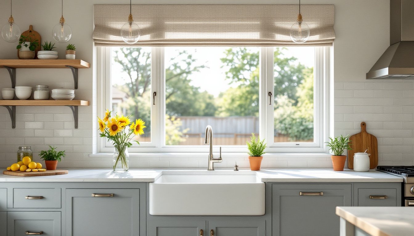
Classic White: Timeless Elegance for Any Home Style
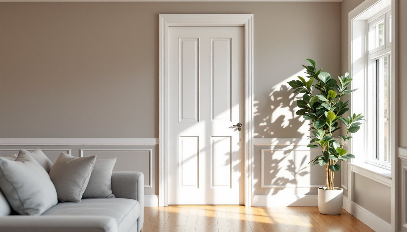
White trim remains the most popular choice in North American homes, and for good reason. It’s versatile, brightens spaces, and pairs with nearly any wall color. But “white” is not a single color, there are warm whites, cool whites, and everything in between.
Pure whites like Benjamin Moore’s Chantilly Lace (OC-65) or Sherwin-Williams’ High Reflective White (SW 7757) deliver a crisp, clean look. They work well in modern or Scandinavian-inspired interiors and pair beautifully with cool grays or bold accent walls. These whites have minimal undertones, so they won’t shift yellow or pink in different lighting.
Warm whites such as Benjamin Moore’s Simply White (OC-117) or Sherwin-Williams’ Alabaster (SW 7008) have subtle cream or beige undertones. They soften the starkness of pure white and complement wood floors, warm neutrals, and traditional architecture. If your home has honey oak flooring or warm-toned brick, a warm white trim prevents the jarring clash that can happen with cool whites.
One common mistake: choosing trim white based on a paint chip under fluorescent store lighting. Always test samples in your actual space. Paint a 2′ × 2′ section on trim near a window and observe it at different times of day. Morning light, afternoon sun, and evening artificial light can all shift how white reads.
White doors and trim also provide flexibility for future repaints. Change wall colors without worrying whether your trim will clash. For DIYers working in stages, white trim is a safe foundation while you figure out the rest of your palette.
Bold and Dark: Dramatic Door and Trim Combinations
Dark trim has surged in popularity as homeowners embrace moodier, more dramatic interiors. Black, charcoal, deep navy, and forest green trim creates striking contrast and adds a contemporary edge to both modern and traditional homes.
Black trim (Sherwin-Williams’ Tricorn Black SW 6258 is a go-to) works particularly well in homes with large windows, white or light-colored walls, and good natural light. It frames windows like gallery art and makes glass appear larger. In rooms with minimal trim, think flat casings and simple baseboards, black adds visual weight without relying on ornate profiles.
Deep navy or charcoal trim softens the starkness of black while still delivering contrast. These colors pair well with warm whites, blush tones, or earthy terracottas. They’re especially effective in dining rooms, libraries, or bedrooms where you want a cozy, enveloping feel.
Dark door colors can anchor a space. Painting interior doors a shade darker than trim, say, black doors with charcoal trim, adds subtle layering. Or go monochromatic: dark walls, dark trim, and dark doors create a cohesive, cocoon-like effect. This approach works in powder rooms, home offices, or accent spaces where you want to make a statement.
Caution: Dark colors show dust, streaks, and imperfections more readily than white. Surface prep is critical. Fill nail holes, sand smooth, and prime with a high-quality stain-blocking primer (BIN or Kilz 2 are solid choices). Plan on at least two finish coats for even coverage, especially over previously painted white trim.
Dark trim also requires more paint. Darker pigments don’t hide as well as whites, so budget for an extra quart per room compared to what you’d use for white.
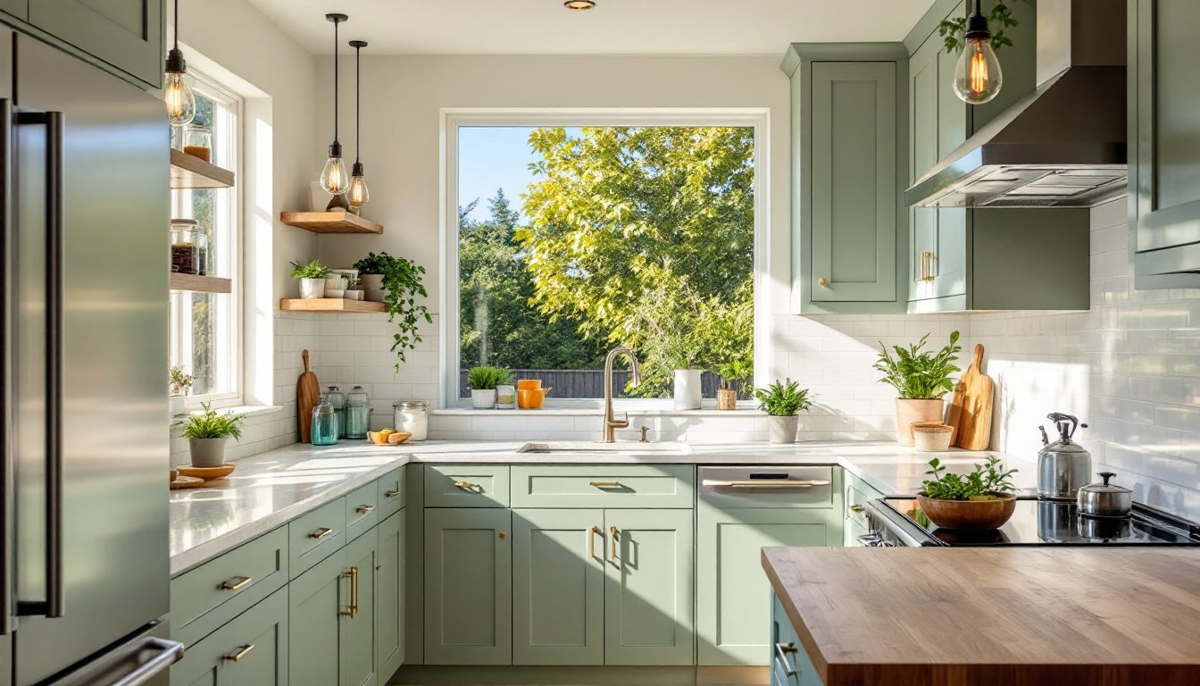
Warm Neutrals: Creating Cozy, Inviting Spaces
Warm neutral trim, think greiges, taupes, soft beiges, and muted tans, bridges the gap between stark white and bold dark tones. These colors create a cozy, layered look and work especially well in homes with warm wood floors, natural stone, or earth-tone palettes.
Greige trim (gray-beige hybrids like Sherwin-Williams’ Accessible Beige SW 7036 or Benjamin Moore’s Revere Pewter HC-172) pairs beautifully with both cool and warm wall colors. It’s subtle enough to feel neutral but has enough warmth to prevent the sterile feel that pure gray can sometimes create. Greige trim is particularly effective in open-plan spaces where you want continuity without monotony.
Soft beiges and taupes add warmth without going full-on cream. They complement natural materials, linen, jute, wood, stone, and support the modern design movement toward organic, tactile interiors. In homes with a lot of white walls, warm neutral trim adds dimension and prevents the space from feeling too clinical.
One advantage of warm neutral trim: it hides dirt and scuffs better than pure white. High-traffic areas, homes with kids or pets, and mudroom trim benefit from this practicality.
When choosing warm neutral trim, consider your flooring. If you have cool-toned gray luxury vinyl plank (LVP) or tile, a greige with gray undertones will harmonize better than a beige with peach or yellow undertones. Test samples next to your flooring in natural light.
Warm neutral doors can either match trim or go a shade darker for subtle definition. In bedrooms and bathrooms, a door that’s one or two shades deeper than trim creates a layered, intentional look without high contrast.
Matching vs. Contrasting: Choosing the Right Approach for Your Space
Deciding whether to match or contrast door and trim colors depends on your home’s architecture, the amount of natural light, and the mood you want to create.
Matching doors and trim creates a cohesive, streamlined look. It’s the safest approach and works in virtually any home style. This is especially effective in:
- Small rooms where too many colors can feel chaotic
- Open-plan spaces where you want visual flow
- Homes with simple, flat-profile trim where you’re not showcasing ornate molding
- Minimalist or modern interiors
Matching also simplifies the painting process. You’re buying one color, one batch, and applying it to all millwork. Less room for error.
Contrasting doors and trim adds depth and visual interest. Common approaches include:
- Dark doors with white trim: Creates drama and makes doors stand out. Works well in homes with high ceilings and good light.
- Doors matching wall color, trim in contrast: This makes trim the star and doors recede. Good for showcasing beautiful casings or baseboards.
- Doors one shade darker than trim: Subtle layering that adds dimension without being bold.
Contrast works best in larger rooms with ample natural light. In small, dark spaces, too much contrast can feel busy and make the room appear smaller.
If you’re unsure, start with matching. It’s easier to add contrast later (by repainting just the doors) than to unify a space where you’ve introduced too many competing colors. Also, understanding Interior Design Trends can help guide your decision based on current aesthetics and timeless principles.
How to Choose the Perfect Finish for Doors and Trim
Paint sheen affects durability, cleanability, and how color appears on trim and doors. For millwork, you’re generally choosing between satin, semi-gloss, and high-gloss.
Satin finish has a subtle sheen, more reflective than eggshell but less shiny than semi-gloss. It hides minor imperfections better than glossier finishes and is easier to touch up. Satin is a good choice for trim in low-traffic areas or if you prefer a softer, less reflective look. It’s durable enough for most applications but may show scuffs more readily than semi-gloss in high-traffic zones.
Semi-gloss is the industry standard for doors and trim. It’s highly durable, easy to clean, and resists moisture better than lower-sheen paints. The slight shine highlights molding profiles and architectural details. Semi-gloss is the go-to for baseboards, door casings, crown molding, and interior doors, especially in kitchens, bathrooms, hallways, and kids’ rooms.
High-gloss delivers a mirror-like finish. It’s the most durable and easiest to clean but also shows every surface imperfection, drips, brush strokes, dings, and uneven sanding. High-gloss works on doors if you want a bold, polished look (think black lacquered doors in a modern space) but it requires flawless prep. Most DIYers find semi-gloss easier to work with.
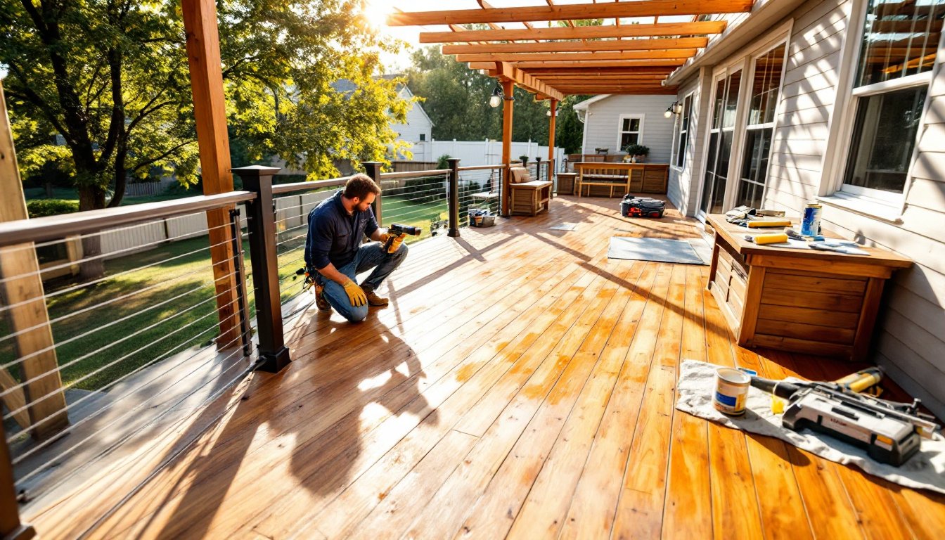
Surface prep is non-negotiable for trim and doors. Sand existing paint lightly with 150-grit sandpaper to rough up the surface and improve paint adhesion. Fill nail holes and dents with lightweight spackle, let dry, then sand smooth. Wipe down all surfaces with a damp cloth to remove dust.
Prime if you’re making a dramatic color change (white to black, for example) or painting raw wood. Use a stain-blocking primer like Zinsser BIN or Kilz 2 to prevent tannin bleed-through and ensure even color coverage.
Application method matters. A high-density foam roller works well for flat-profile doors and wide trim. For detailed molding, a 2″ angled brush gives better control. Apply thin coats, two thin coats always outperform one thick coat. Sand lightly between coats with 220-grit sandpaper for a smooth final finish.
Conclusion
Door and trim colors set the tone for your entire home. Whether you lean toward classic white, bold dark hues, or warm neutrals, the key is understanding how color, sheen, and contrast interact with your space. Staying informed on Interior Design Trends 2025 can also inspire fresh approaches. Test samples, prep surfaces properly, and don’t rush the process. The difference between a DIY paint job that looks DIY and one that looks professional usually comes down to prep work and patience, not talent.