In a world bursting with vibrant hues, moody color schemes invite a refreshing twist that whispers sophistication and intrigue. Picture this: deep greens, rich blues, and sultry purples draping your space like a velvet curtain, transforming the ordinary into the extraordinary. These colors don’t just sit pretty; they tell a story, evoke emotions, and create an ambiance that makes you want to curl up with a good book—or perhaps a glass of wine.
Understanding Moody Color Schemes
Moody color schemes play a vital role in transforming interior spaces. They evoke strong feelings and create an inviting atmosphere.
Definition and Characteristics
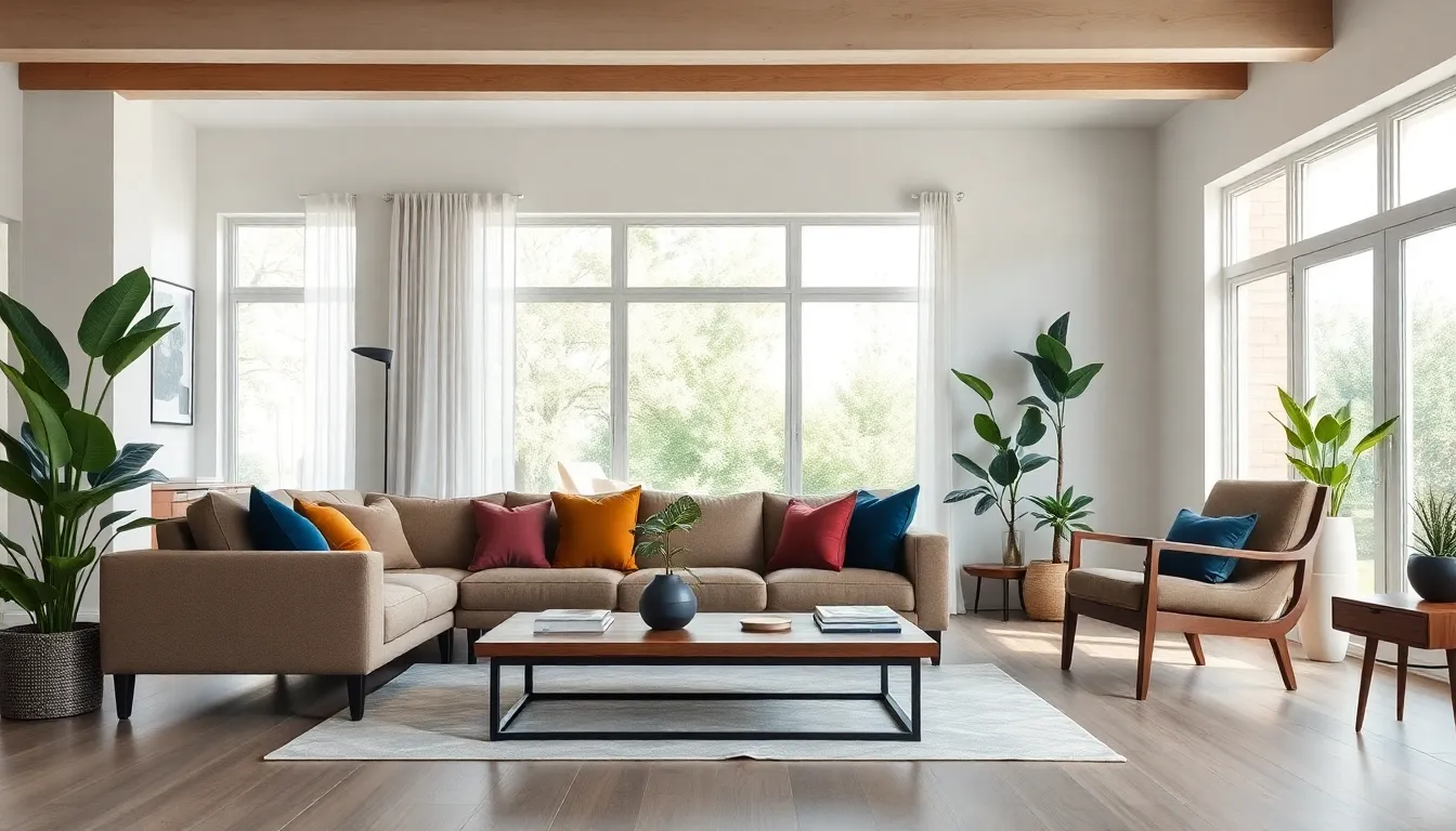
Moody color schemes refer to palettes that incorporate deep, muted hues. Typically, these colors include rich greens, dark blues, and dusky purples. Saturation levels differ among shades, contributing to a cozy, dramatic feel. Characteristics often include warm undertones that enhance comfort while providing depth. Expect a focus on a limited color range, leading to a cohesive design. Additionally, these colors often serve as a backdrop that highlights furniture and decor elements.
Emotional Impact of Color
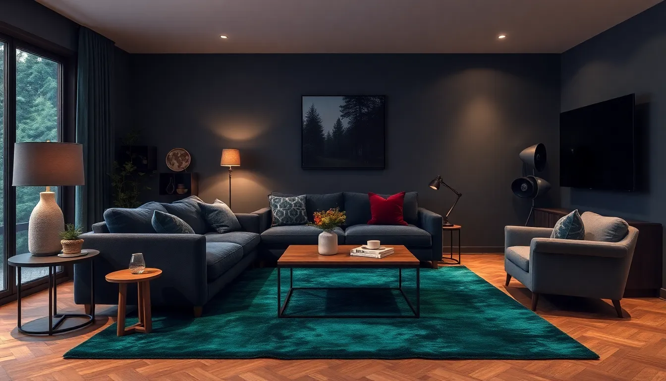
Color significantly influences emotions and perceptions. Deep hues like navy blue evoke calmness, making spaces feel serene. Rich burgundy can create a sense of luxury and warmth, making rooms feel intimate. Softer shades of gray can encourage a soothing effect, softening the overall ambiance. Use of moody colors often fosters reflection, comfort, and even inspiration. Transitioning between different shades allows for personal expression within any given space. Overall, moods shift depending on colors present, influencing the emotional landscape of a room.
Popular Moody Color Palette Combinations
Moody color palettes often feature unique combinations that create striking visual experiences. These palettes evoke emotions and enhance the overall atmosphere of a space.
Dark and Deep Hues
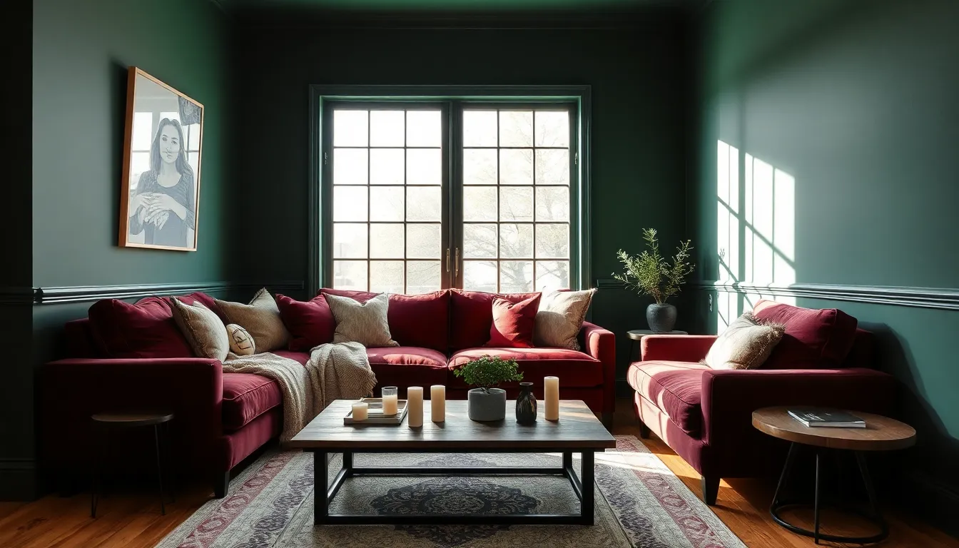
Deep blues, forest greens, and rich burgundies dominate this category. Dark shades create depth, inviting a sense of calm and sophistication. For instance, navy blue paired with charcoal gray can establish a serene environment, while emerald green juxtaposed with black adds a touch of drama. These combinations work effectively in bedrooms and living areas, promoting relaxation. Homeowners often favor these colors for their ability to transform a room into a cozy retreat.
Muted Tones and Pastels
Muted tones and soft pastels present a different approach to moody designs. Dusty rose blends beautifully with muted teal, creating a tranquil setting perfect for meditation spaces. Similarly, lavender alongside sage green evokes a serene, inviting atmosphere. Designers frequently utilize this palette in children’s rooms and creative spaces, balancing cheerfulness with relaxation. These gentle shades, when mixed thoughtfully, offer a soft yet sophisticated aesthetic, enriching the ambiance without overwhelming it.
Applications of Moody Color Schemes
Moody color schemes enhance various design fields by creating distinctive atmospheres. Deep, muted hues evoke profound emotions and contribute to compelling visual experiences.
Interior Design
In interior design, moody color schemes transform spaces into inviting sanctuaries. Rich colors, such as emerald green and navy blue, make living rooms feel sophisticated while promoting relaxation. Bedrooms benefit from deep burgundy, fostering intimacy and warmth. Accent walls painted in dark shades create striking focal points without overwhelming the room. Textures, like velvet and leather, complement these colors, enhancing the overall aesthetic. Elevated designs emerge where moody palettes harmonize with statement furniture and art pieces.
Graphic Design
Graphic design leverages moody color schemes to evoke specific feelings and guide viewer attention. Designers often choose dark, muted palettes to create impactful branding materials that resonate with target audiences. Rich tones generate emotional connections while maintaining a cohesive look. Illustrations featuring moody colors can create captivating narratives or emphasize key elements within a layout. By strategically utilizing these hues, designers influence the perception of products, enhancing marketability. Ultimately, employing moody colors can yield striking graphics that captivate viewers and promote brand identity effectively.
Tips for Implementing Moody Color Schemes
Implementing moody color schemes effectively enhances a space’s aesthetic and emotional appeal. Focus on strategic color choices and light balance to create inviting environments.
Choosing the Right Colors
Selecting the right colors is crucial for achieving a moody ambiance. Rich hues like deep greens, blues, and purples evoke strong emotions. Consider pairing these deep tones with softer shades for contrast, promoting visual interest. Individual preferences play an essential role; identify colors that resonate personally. Neutral bases can ground moody palettes, ensuring a cohesive design. Assess natural lighting to evaluate how colors shift throughout the day. Ultimately, a well-chosen palette fosters a balanced atmosphere that invites relaxation.
Balancing Light and Dark
Balancing light and dark shades creates depth in moody designs. Use lighter accents to highlight architectural features or furniture, ensuring the space doesn’t feel heavy. Dark walls can anchor a room while light trim adds brightness. Echoing the interplay between light and dark also creates a dynamic visual experience. Incorporate various textures to enhance the balance, such as plush fabrics against sleek surfaces. A thoughtfully balanced approach ensures a harmonious environment that feels cozy yet sophisticated.
Conclusion
Moody color schemes offer a unique opportunity to transform any space into a haven of comfort and sophistication. By embracing deep and muted hues designers can evoke a range of emotions that enhance the overall atmosphere. These palettes not only highlight furniture and decor but also create a cohesive and inviting environment.
Whether it’s the calming effect of navy blue or the warmth of rich burgundy each color plays a vital role in shaping the emotional landscape of a room. Thoughtful combinations of these shades can lead to striking visuals that resonate with personal expression. Ultimately moody color schemes invite creativity and reflection making them an essential choice for anyone looking to elevate their interior design.